Animation is fast becoming an essential part of interface design, and it’s easy to see why. It gives us a whole new dimension to play with—time. This creates opportunities to make our interfaces better at every level: it can make them easier to understand, more pleasant to use, and nicer to look at.
Article Continues Below
For example, animation can help offload some of the work (PDF) of processing interface changes from our brains to the screen. It can also be used to explain the meaning and relationships of interface elements, and even teach users how to do things—all without making an interface more complex.
Sometimes all of these factors converge: when you minimize a window, would you be able to tell where it goes without the animation? How much longer would it take you to find the minimized window in the dock?
So far, so uncontroversial, right? Animation is a good thing—when done well, at least. But there’s one aspect of animation that nobody ever seems to talk about. Some animation, while technically well executed, makes interfaces more confusing instead of less.
Consider the following process:
When we tap the Overcast app icon on the homescreen, the icon zooms and morphs into the app. The other icons stay in place. They’re still in their initial positions, laid out in a grid around the open app.
We start multitasking. The app zooms out. We should get back to the icons around the app on the homescreen, but instead we see a stack of other apps. Why is the icon above the app now? Where are all the other icons? And why does another homescreen appear next to the apps?
The app is both inside its icon on the homescreen and next to the homescreen. The two animations give us conflicting information about where the homescreen and the apps are located in space.

These animations might make sense if you designed the individual screens in a vacuum. It’s only when they all try to play together as parts of a single experience that things get confusing. The problem isn’t with any of the individual transitions, but with the fact that the animations contradict each other.
How did we get here? Let’s take a step back and quickly review the history leading up to this point.
Since their inception in the 1970s, graphical user interfaces were basically a series of static screens (PDF) linked together without any transitions. Every state change was a hard cut.
Although there are some notable early examples of good interface animation that date all the way back to the original Macintosh (PDF), because of the limited graphical capabilities of computers back then, effective animation was the exception rather than the rule.
As computers got increasingly powerful, animation started to be used more frequently for things like maximizing windows or opening new tabs. It was still mostly pressed into service for small things, though, and rarely influenced the overall structure of interfaces.
Only now are we starting to get to a point where computing resources aren’t holding interfaces back anymore. With today’s devices, everything can be animated—and increasingly everything is. The problem is that the design process hasn’t caught up to this change in technology. For the most part, interfaces are still conceived as separate, static screens and then linked together with relatively crude animations.
This is probably how our multitasking example came to be; different parts of the experience were designed separately and then linked together without considering either the relationships between them or the consequences of arranging them this way. The problem is that if animation (and therefore the spatial structure of an interface) is an afterthought, it’s all too easy to create contradictory behaviors.
Now that we’ve figured out how we got here, let’s think about how we can avoid such pitfalls.
Adding animation to interfaces fundamentally changes them, and necessitates a new way of thinking. We call this new approach semantic animation. It all starts with a simple conceptual shift:
You can’t treat individual screens as separate entities if the transitions between them are animated. To the user, the entire experience is one continuous space.
Similarly, two representations of the same element on different screens can’t be seen as separate from each other. To the user, there is only one element—it simply changes form.
This means that when you add animations, an interface isn’t a series of screens anymore, but a collection of semantic components inside a single, continuous space. These self-contained components enclose everything associated with them, like meta information or interactive controls.
This may sound complicated, but in practice it’s actually quite simple: instead of designing screens and then adding transitions between them, start by designing individual components and thinking about how they change and move in different contexts. With that in place, layout and animations will come together naturally, following the semantic structure of the content.
Explain relationships between elements#section4
Animations are most useful when they reflect and reinforce the semantic relationships between elements: for example, “this comment belongs to this article,” or “these menu items are part of this menu.”
Think of every element of your interface as a single, self-sufficient component with a specific meaning, state, and position in space. Then make sure your animations reflect this. If a popover belongs to a button, it shouldn’t just fade in; it should emerge from that button. When opening an email, the full message should not just slide in from the side, but come from within the preview.
You get the idea, right? Once you’re used to this way of thinking, it almost becomes second nature.
The following examples show two completely different approaches to the same problem: one is screen-based; the other takes semantic animation into account. When opening Launchpad on OS X, the app icons just fade in and the background is blurred. This doesn’t tell the user anything about where the icons come from and what their relationship is with other parts of the interface.
The app drawer in GNOME (a desktop environment for GNU/Linux), on the other hand, uses an animation that elegantly explains where the icons come from and where they are when they’re not visible.
Multiple representations#section5
A common problem to look out for is different representations of a single element that are visible at the same time. This is bad, because it doesn’t make sense from the user’s point of view to see the same thing in more than one place simultaneously.
In the following example from Google’s Material Design Guidelines, when you tap on an image in a list view, a bigger version of the image is shown. The bigger version slides in from the right on a separate layer. This is a textbook case of multiple representations: there’s no connection between the two images.
Why is the image both in the list view and on that other screen? Are all of the big versions of the images stacked to the right?
Google recently changed this example in their guidelines. Here’s the updated version:
The new example is better because there are no multiple representations, but the animation fails to account for the interface elements on top, which change with no animation at all.
Now, here’s an instance of something that checks all the boxes: Facebook Paper’s timeline makes the relationship between thumbnail and detail view completely obvious. No multiple representations, no semantic loose ends. The transition is so smooth that you barely notice the state change.
See how the interface elements on the bottom of the detail view come from within the image? The image is a self-sufficient component, containing all of the information and actions associated with it.
Another example of how to do this well is Apple’s Passbook app. It may seem unremarkable at first, but imagine if it behaved like the first Material example, with the full cards sliding in from the right when you tap a list item. That would be ridiculous, wouldn’t it?
The transition between list and detail view is so fluid that you don’t really think of it as a transition; the elements just naturally move in space. This is semantic animation at its best.
Keep space consistent#section6
Animations create expectations about where the animated elements are in space. For example, if a sidebar slides out to the left, you intuitively know that it’s somewhere left of the visible elements. Thus, when it comes back into view, you expect it to come in from the left, where you last saw it. How would you feel if it came back in from the right?
Lest they break the space established by earlier animations, animations should not communicate contradicting information. Our earlier iOS multitasking example shows exactly why this is problematic: two different transitions tell the user conflicting things, completely breaking their mental model of the interface.
Interestingly, OS X does something similar, but handles it in a spatially consistent way. When you full-screen a window, it scales to fill the entire screen, similar to iOS. However, it also moves horizontally to a new workspace. The window isn’t inside the first workspace anymore; spatial consistency is thus preserved.
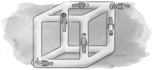
Remember: violating spatial consistency is the user interface equivalent of an M.C. Escher painting. So unless your app is Monument Valley, please make sure to keep your space simple and non-contradictory.
Practical considerations#section7
Right now you may be thinking, “But wait—there’s no way to apply this to everything!” And yeah, you’re probably right.
If you did manage to do that, you’d end up with something like a single, zoomable surface containing every possible state of the system. And although that’s an interesting idea, “pure” zoomable user interfaces tend to be problematic in practice, because they’re hard to navigate if they go beyond a certain level of complexity (PDF).
When designing real products, semantic animation needs to be balanced with other considerations like user experience and performance. Most of your interfaces are probably never going to be 100 percent correct from a semantic-animation perspective, but that’s okay. Semantic animation is a way of thinking. Once you’ve adopted it, you’ll be surprised how many things it applies to, and how much low-hanging fruit is out there. It forces you to think about hierarchy and semantics, which helps you find simpler solutions that make more sense to the people who use your products.
Note that we, the authors, are far from having figured all of this out yet. Our article doesn’t touch on many important questions (which we’re still exploring) related to the consequences of animating interfaces. Nevertheless, we’re convinced that semantic animation is a promising idea with real potential for making digital interfaces more intuitive and comprehensible.