Material honesty—the idea that a substance should be itself, rather than mimic something else—has guided everyone from Ruskin, an art critic, to Charles and Ray Eames, designers of the iconic plywood chair (LCW).
Article Continues Below
By stripping away any coverings and celebrating both its material and its manufacturing process, the chair lays bare exactly what it is: molded plywood. In so doing, it is modern, functional, and timeless—so timeless, in fact, that it’s been continually produced for eighty years.

Today there’s a materials debate between flat and skeuomorphic design. While design debates are healthy, too much finger-pointing is prolonging the problem—web folks on all sides are still figuring out their sensibilities to and vocabulary for web materials.
Fortunately, the material honesty debates of the nineteenth and twentieth centuries have given way to mature philosophies with practical guidelines—guidelines we can now use to develop our awareness to web materials, produce longer-lasting work, evaluate design processes more wisely, and collaborate better with common tools and unambiguous terminology.
It starts by defining the core web materials and understanding when they’re honest, and when they’re not.
Web materials fit nicely into three categories.
- Foundation: HTTP, URLs, and HTML
- Style: CSS
- Decoration: Raster graphics
Foundational honesty#section3
Paul Robert Lloyd’s article, “The Web Aesthetic,” lays the foundation.
The web could almost be considered a composite, made up of HTTP (the how), URLs (the where), and HTML (the what). Omit any one of these ingredients and you’re no longer building the web.
Layer what you want on top, but if these protocols don’t exist, it’s not the web. It’s not honest.
For example, a Flash site that lacks foundational materials won’t load on many popular devices. Since honest URLs for each page in the Flash site don’t exist, they’re really dishonest pages that are difficult to permalink, not sharable in predictable ways, and hard to navigate because the browser back button can produce unexpected results. Some search bots can index Flash content, but since it’s not delivered with honest HTML, all kinds of SEO, accessibility, and updatability issues arise. It’s no secret that poorly planned AJAX interactions can be dishonest for these same reasons.
Stylistic honesty#section4
Imagine you’re in the zone, typing CSS with lightning speed. All of a sudden you have to stop typing, shift your mindset, launch a new app, create a linear gradient raster image in a painting application like Photoshop, and finally, add it to a sprite file to produce a gradient from #4d90FE to #4787ED. This is a hack—it creates a process and material that’s not honest on the web. As a result, the gradient’s color can’t be changed easily. The raster image doesn’t grow without losing fidelity and it adds another HTTP request to your page load. It’s dishonest.
Raster gradients are just one example. Rasterized icons, text, textures, and lighting effects like drop shadows are common, too. In every case, a bit of the web’s universality is removed.
Pure CSS, on the other hand, doesn’t load raster images.
Pure CSS isn’t just about removing impure elements like background-image, list-style-image, border-image, and cursor:url from your work, though. It’s also about honoring the manufacturing process, rather than mimicking physical materials. You see, the more interwoven the relationship between the appearance and the manufacturing process is, the more honest the material.
Here’s an example: A pure CSS button that’s crafted to look like a vintage stereo knob is dishonest. Yes, even though it’s pure CSS. It’s dishonest because the material mimics something it’s not. It looks like a hi-fi component manufactured from steel, but it’s manufactured from CSS. The look and the manufacturing process are disconnected, like Ruskin’s fake stones.
Even lighting effects like drop shadows, form shadows, specular highlights, and reflections are dishonest because there’s no light source inside a digital screen that’s manufacturing these lighting effects.
Without all the shading, shadows, and bulbous buttons, we get a flatter (or honest, or native, or authentically digital) web. Call it what you will, the flat web focuses more on content. It’s quick to craft. It loads quickly, too. Designer and developer workflow is more collaborative because both use the same tools.
Talented “flatlanders” add emotional depth to their work, but it’s not the kind that wows on Dribbble. When viewed as a static screen, flat web design shoots air balls.
The palette of emotional design for flatlanders is instead temporal. Temporal beauty lives in state-change animations, nuanced timing effects, strategically placed user feedback, and other “interesting moments,” not drop shadows and Photoshop layer effects. Flatlanders build all kinds of emotion and depth combining these moments with delightful microcopy, personality, and typography. All honest—all web—all good.
In his 1953 essay, The Language of an Organic Architecture, master architect Frank Lloyd Wright called this kind of aesthetic “of the thing, not on it.”1
Again and again, design history shows that when we try to trick a viewer into believing a material is something it’s not, the value and the timelessness of the design decrease. Industrial designer Norman Bel Geddes—and others—wrote volumes on this topic in the early twentieth century. Geddes coined his use of materials as “a sincere style…of the materials involved.”
Consider a 1980s microwave oven wrapped in a simulated wood veneer. Products like these went out of style quickly, because dishonest materials cheapened their design, quickly turning them into eyesores of peeling veneer rather than timeless machines. But a microwave oven that exposes the manufacturing process of stainless steel remains mechanically intact, demands higher prices, and is more stylistically relevant, even to this day.
Decorative honesty#section5
Assuming the foundational and stylistic honesty exists, a decorative layer can (but doesn’t have to) live on top. This outermost web material is broken into groups: micro metaphors and macro metaphors.
Micro metaphors—a nondescript Gaussian noise texture, or maybe a shopping cart or trashcan icon—are dimensionally small, and so is their influence on the aesthetic. Replace that trashcan icon with a link labeled “Trash” and the site’s usability and aesthetic remain intact. Micro metaphors are cool. Don’t sweat ‘em.
Macro metaphors, on the other hand, are big—like an interface that looks like a three-ring binder with translucent multi-colored plastic divider tabs. They drive the aesthetic, and the design falls apart without them.
Designers sometimes use macro metaphors to create wowtastic design reviews of static mockups, to leverage their skills with outdated tools and processes, or just out of habit. But for end users, macro metaphors are dishonest, no matter how you slice ‘em.
It’d be fun to rant on about pure, ivory tower honesty. But it’s not that simple, and there are times when decoration adds value. Drew Wilson’s attitude is right on when he says, “whatever looks good and is usable.” His premise is similar to Tufte’s “whatever it takes,” and even Frank Lloyd Wright’s “less is only more where more is no good.”
So, contrary to what the detractors say—there is a place for decoration, and a place for material honesty. These two exist on a continuum, with decoration at one end and material honesty at the other. There’s no precise point at which a design becomes honest or dishonest. The web designer has the messy job of sorting it out.
How long does the design need to be stylistically relevant? How easy does the site need to be to edit? Does the client really love skeu’d-out designs, and with rent due, can you afford to risk losing them as a client in order to steer them away from what they love? Or, if you’ve spent years training your clients to judge web design by the look of static Photoshop comps, then you’ll have a transition period in which you adjust your design process while you re-train your clients to focus on your designs’ interesting moments and universal access. This can’t happen overnight, but if you’re conscious of your design decisions, you can move along the continuum in the direction you’d like to go.
The great jazz musicians say: You have to know the rules to break the rules. Like philosophically astute industrial designers and architects, web designers who are aware of where their work lies on the continuum can break the rules, be playful, and still produce great, lasting work.
The plastic planter base of Stefano Giovannoni’s budding toilet bowl brush pretends to be earthenware. But, it works! And, you can bet Stefano knew exactly which rules he was breaking.

Not only is it emotional and fun, its affordances and ergonomics are masterfully designed. It still looks current and has been continually produced for twenty years.
A materially honest process#section7
Just as the Eames chair required a new manufacturing process, the honest web demands a new approach to web design—an approach defined less by fixed comps and more by rapid iteration and prototyping.
Rather than look for material honest processes in a long list of new software design tools (many of which will come and go quickly), we should invest in honest tools that will forever be part of the designer’s toolkit.
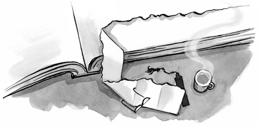
Enter the pen sketch.
Pen sketches are—and will forever be—the fastest, cheapest, and most universal way to create and share your ideas for any medium, particularly in early ideation phases. The pixel precision of wireframes can lead clients—and designers—into thinking there’s no design work left to explore once the first round of wireframes is complete. Or, precise wireframes can lead them to fuss with fonts, styling, and alignment of elements on a grid. These are the wrong things to focus upon in early design phases.
Because pen sketches are so far removed from web materials, they’re never confused for the final design. Even if you wanted to, it’s hard to fuss about fonts in a pen sketch. This keeps everyone focused on the right things at the right time. After the concepts are resolved through pen sketching, designers can work honestly with clients and design in the browser to bring the visual ideas and prototypes to life.
At 29th Drive, we start most projects with pen sketches. Our customers know the sketches are coming because we talk about sketching in our sales process and again in a “What To Expect” page in our proposals.
None of our customers are in Scottsdale, so we use the IPEVO document camera to screen-share big, easy-to-read sketches (created in real time or in advance). IPEVO has a fixed focus mode so that when your hand enters the frame, the camera’s focus remains fixed on the paper. You can’t do this effortlessly with a webcam.

We often work from home and use the IPEVO to collaborate with the rest of the team in the office. It keeps the process human. We even send cameras to our customers so they can sketch with us. It takes time for non-designers to overcome the “I’m not an artist” stage fright, but with some encouragement, they’ll eventually sketch their first beautifully crooked box—and better collaboration is born.
Paper prototyping techniques are great in person, but they don’t jibe with scanners. So if you’re working remotely from your clients, video record the screen with Go To Meeting and snap photos (another handy feature of the IPEVO) while you present the paper prototypes. Afterward, post the video and stills to a centralized archive you all can access.
Betting on your future#section8
Working with honest materials is exhilarating. The folks at Typekit must have felt it when they first brought true typography to the web (web fonts are more honest than SIFR or rasterized text, right!?). Ethan Marcotte must have felt it when he first articulated his responsive web design principles. Indie designers and developers who create honest CSS frameworks or WordPress templates feel it, I’m sure.
By using honest materials, these folks have become leaders in the design community—people who’ve not only innovated, but also spurred others to take their ideas further. That’s rewarding—and profitable. In the coming years we’ll see a divide emerge between web designers who choose to make sense of the messy work needed to adapt to an honest spot on the continuum, and those who do not. It’s time we stop pointing fingers and start looking to the lessons of Eames, Wright, and Giovannoni: Material honesty will breed longevity—in our work and our careers.