Unless you’re a fan of dark or shady patterns, you probably struggle occasionally with integrity in your design practice: balancing stakeholder wishes against user needs, for example, or guiding users to hero paths while also granting them freedom to explore.
Article Continues Below
Recently, I worked on redesigning a mobile timebanking app, which helps neighbors share services and build supportive relationships. The public-good aspect of the project was appealing; the app’s values of community, trust, and support kept us focused on meeting users’ needs and being honest in our design. So of course we wanted to show users only information that was literally, concretely true. But what if a slight deviation from the truth would make users happier and more efficient in achieving their goals? What if fudging an interface helped reassure and speed the user along her way?
This isn’t an uncommon issue. You’ve probably run into “Close Door” buttons that don’t really close the elevator, or sneaky progress bars that fill at an arbitrary rate—these false affordances and placebo buttons are everywhere, and might make life seem a bit easier. But is this ethical design? And can we build a framework for working with false affordances and designing with integrity?
What’s the hubbub?#section2
Timebanks are local, virtual exchanges in which neighbors can post requests for and offers of service in exchange for “timedollars,” a non-fungible alternative currency based on an hour of service. For example, if I do an hour of sewing for you, I can turn around and “spend” that one timedollar I earned on having someone mow my lawn for an hour. Granted, I can’t sew and don’t have a lawn, but you get the idea.
By enabling neighbors to connect and help each other, timebanks create community in what was just a location. Through mobile timebanking, people feel more connected with their neighbors and supported in their daily lives—in fact, that’s the value proposition that guided our project.
With teams recruited from PARC, Pennsylvania State University, and Carnegie Mellon University, our goal was to redesign the existing timebanking mobile app to be more usable and to connect users more easily through context-aware and matching technologies.
We started by evaluating issues with the existing app (mapping the IA, noting dead ends and redundancies, auditing the content) and analyzing the data on user actions that seemed most problematic. For instance, offers and requests for timebanking services were, in the existing app, placed in multilevel, hierarchical category lists—like Craigslist, but many layers deep.

Our analyses showed us two interesting things: first, that the service requested most often was a ride (such as to the doctor or for groceries; the user population was often older and less physically mobile); and second, that many postings by users to offer or request rides were abandoned at some point in the process.
We speculated that perhaps the timely nature of ride needs discouraged users from posting a request to a static list; perhaps drivers wouldn’t think of diving down into a static list to say, “Hey, I commute from near X to Y at about this time a few days a week—need a lift?” So we incorporated walk-throughs of the old app into semi-structured interviews we were already conducting in our research on peer-to-peer sharing motivations; participants’ actions and responses supported our speculations.
With that in mind, we proposed and started prototyping a new feature, TransportShare, at the top level of the app. We hoped that its presence on the app’s home screen would encourage use, and its similarity to popular ride-requesting apps would ease users into the experience.
We created a list of parameters the user would have to specify: starting/pickup point, ending/drop-off point, pickup time, “fudge factor” (how flexible this time is), one-way/roundtrip, and a text field for any special needs or considerations. Then we built prototypes, moving from sketches to low-fidelity mockups to higher-fidelity, interactive prototypes using Sketch and Invision.
The choices we make#section3
Our ethical dilemma emerged as we designed the ride-request process. After the user specifies “Start” and “End” points for a ride, the app shows a summary screen with these points, the time of the ride, and a few options.

Since you’re all crackerjack designers, you’ve noticed that there is no line connecting the Start and End points, the way there is in other apps that plot a route, such as Google or Apple Maps. This was intentional. Our user research showed that people offering rides were often running other errands or may need to make detours. Since we could not anticipate these needs, we could not guarantee a specific route; showing a route would be, to some high degree of probability, wrong. And—particularly in an app that hinged on community values and honesty—that felt deceptive.
Being truthful to the nth degree is the ethical choice, right? We wouldn’t want to display anything that might not be 100 percent accurate and deceive the user, right? Doing so would be bad, right? Right?
Oh, I was wrong. So, so wrong.
And lo, came…a test#section4
At this point, we had solid research questions we wouldn’t have had at an earlier stage and clean, clickable prototypes in Invision we could present to participants. With no budget for testing, I found prospective participants at a Meetup designed to let people share and test their projects and selected the ones who had used some form of peer-to-peer app. (We are planning subsequent usability tests with more senior participants, specifically for readability and accessibility.)
I conducted the tests with one user at a time, first briefing them on the nature of timebanks (you’ve lived through that already), and setting the scenario that they are in need of a neighbor to drive them to a nearby location. They were given latitude in choosing if this would be a ride for now or later, and one-way or roundtrip. Thinking out loud was encouraged, of course.
As they stepped through the task, I measured both the time spent per screen (or subtask) and the emotional response (gauged by facial expression and tone of responses).
| Subtask | Average | Outlier | Emotion |
|---|---|---|---|
| 1: Set request time | 11s | 12s | |
| 2: Set one-way/round-trip | 10s | 17s | |
| 3: Pick start | 7.5s | 11s | |
| 4: Pick destination | 6s | 8s | |
| 5: Confirm request | 9.5s | 14s | |
| 6: Review request | 14.8s | 18s |
The users tended to move easily through the entire task until they hit Subtask 6 (reviewing the request at the summary screen), and I saw there was a problem.
Participants visibly hesitated; they said things like “ummm…”; their fingers and eyes traced back and forth over the map, roughly between the tagged Start and End points. When I asked open-ended questions such as, “What are you seeing?” and “What did you expect to see?” the participants said they were expecting to see route lines between the Start and the End.
In debrief sessions, participants said they knew that any route they might have seen on the summary screen wouldn’t be the “real” route, that drivers may take different paths at their own discretion. But the lack of lines connecting the Start and End points disconcerted them and caused hesitation and unease.
Users were accustomed to seeing lines connecting the end points of their trip. I could see this in the time it took them to interact with that screen, in their faces, and in their think-alouds. Some thought they couldn’t complete the task or that the app wasn’t finished with its job; others reported a lower level of trust in the app. We’d made an assumption—grounded in honesty—about what users wanted to see, and discovered that it did not work for them.
With these results in mind, I decided to run a smaller usability test with the same protocol and screens, with one change: a line connecting the Start and End points.

This time, the participants said they knew the drivers might not take that route, but it didn’t matter—route lines were what they expected to see. (Perhaps this is an indication they may not trust Google or Apple Maps pathfinding, but we’re not at that level of cynicism, not yet.)
| Subtask | Average | Outlier | Emotion |
|---|---|---|---|
| 1: Set request time | 7.8s | 13s | |
| 2: Set one-way/roundtrip | 9.8s | 11s | |
| 3: Pick start | 6.5s | 8s | |
| 4: Pick destination | 5.3 | 6s | |
| 5: Confirm request | 6.8s | 8s | |
| 6: Review request | 8s | 9s |
I graphed out the average user time per screen and averaged emotional response (observed: positive, negative, meh). I think it’s not unreasonable to see low time per interaction plus positive emotion as a good sign, while high time per interaction plus negative emotion as a sign that I needed to go back and look at a problem.

The difference is just a line—a line participants are either explicitly or implicitly aware isn’t a true representation of reality. But the participants found the line comforting, to the point where, without it, usability took a serious hit.
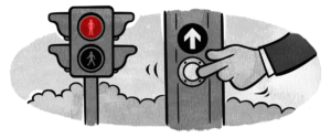
So when you get in an elevator, do you press the “Close Door” button? If so, what prompted you? Did you press it once and wait, or keep pressing until the door actually closed? How did that make you feel, the pressing, or even just the existence, of said button?
Of course, we now know that the “Close Door” button does exactly nothing. It’s a false affordance, or placebo button.
Which brings us back to the ethical question. Should I design in elements that do not technically mislead, but reassure and increase comfort and effectiveness of the product for the user? Does intention prevent this from being a dark pattern?
Remember, dark patterns are dark not because they aren’t effective—they’re very effective—but because they put the user in positions of acting against their own interests. Kim Goodwin speaks of well-designed services and products acting as considerate humans should act; perhaps sometimes a considerate human tells white lies (I’m not judging your relationships, by the way). But then again, sometimes white lies are a seed that turns into an intractable problem or a bad habit. Is there a way to build a framework so that we can judge when such a design decision is ethical, instead of just effective?
I originally wrote about this only to ask a question and open a conversation. As a result, the heuristics below are in the early stages. I welcome feedback and discussion.
- Match between affordance and real world. The affordance (false or placebo) should relate directly to the situation the user is in, rather than lead the user away to a new context.
- Provide positive emotional value. The designed affordance should reassure and increase comfort, not create anxiety. Lulling into a stupor is going too far, though.
- Provide relief from anxiety or tension. If the product cannot provide positive emotional value, the affordance should serve to reduce or resolve any additional anxiety.
- Increase the user’s effectiveness. The affordance should help improve efficiency by reducing steps, distractions, and confusion.
- Provide actionable intelligence. The affordance should help the user know what is going on and where to go next.
- Add context. The affordance should offer more signal, not introduce noise.
- Move the user toward their desired outcome. The affordance should help the user make an informed decision, process data, or otherwise proceed towards their goal. Note that business goals are not the same as user goals.
- Resolve potential conflict. An affordance should help the user decide between choices that might otherwise be confusing or misleading.
These are not mutually exclusive, nor are they a checklist. Checking off the entire list won’t guarantee that all of your ethical obligations are met, but I hope that meeting most or all of them will weed out design that lacks integrity.
One unresolved question I’d like to raise for debate is the representation of the false affordance or placebo. The “Close Door” button wouldn’t work if labeled “This Doesn’t Close the Door but Press it Anyway,” but in my case we do want to make the user aware that the route line is not the route the ride will necessarily take. How to balance this? When does it become deception?
In addition, I can recommend Dan Lockton’s Design with Intent toolkit, licensed under the Creative Commons 3.0 standard. And Cennydd Bowles has written and spoken on the larger issues of ethical design; if this is a topic of interest (and indeed, you’ve read many words on the topic to get to this point), it’s worth diving into his site.
I hope to keep thinking about and refining these heuristics with additional feedback from designers like you. Together, let’s build tools to help us design with integrity.